🎨 How To Add Color To A Neutral Room
I remember standing in my first apartment, surrounded by four beige walls and a tan carpet that seemed to swallow every ounce of personality I possessed.
It felt less like a home and more like a waiting room, so I spent the next decade learning how to weave vibrancy into quiet spaces without losing that sense of calm.
This guide comes from years of trial, error, and a deep love for how a single splash of mustard yellow or sage green can completely shift the energy of a room.

Quick Overview
You are about to transform your muted space into a curated sanctuary that reflects your unique personality.
- Time needed: 2 to 6 hours for styling, or a full weekend for painting projects.
- Difficulty: Beginner
- What you’ll need: Throw pillows, area rugs, indoor plants, wall art, and a clear vision of your favorite hues.
Step-by-Step Instructions
Step 1: Identify Your Neutral Undertones
Look closely at your existing “neutral” colors to see if they lean warm or cool.
Beige, cream, and tan usually have yellow or pink undertones that pair beautifully with earthy terracotta or olive greens.
Gray, white, and charcoal often have blue or purple undertones that sing when matched with navy, emerald, or crisp citrus tones.
Check your walls during different times of the day to see how the natural light changes the base color.
A gray wall might look blue in the morning but flat in the evening, which dictates which accent colors will hold their vibrance.
Pro Tip: Hold a piece of pure white paper against your wall or sofa to instantly reveal the hidden undertones of your neutrals.
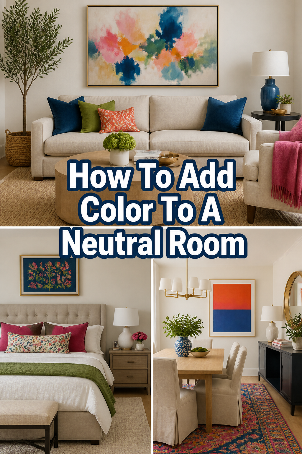
Step 2: Choose a “Hero” Color
Select one primary color that you genuinely love rather than following a fleeting trend.
This “Hero” color will act as the anchor for your room, appearing in at least three different places to create a sense of intentionality.
Apply the 60-30-10 rule to keep the space balanced and professional.
Your neutral base should take up 60% of the room, your secondary color 30%, and your boldest accent color just 10%.
Consider how you want the room to feel before committing to a specific shade.
Soft blues and greens promote rest in a bedroom, while vibrant oranges or deep reds can stimulate conversation in a dining area.
Step 3: Layer Your Textiles
Swap out plain pillow covers for versions that feature your chosen accent colors in various patterns.
Mixing a solid colored pillow with a subtle stripe or a floral print keeps the eye moving and prevents the color from feeling heavy.
Drape a textured throw blanket over the arm of a chair or the foot of the bed.
The fold of the fabric creates shadows and highlights, making the color look richer and more inviting than a flat surface.
Introduce a rug that incorporates both your neutral base and your new accent colors.
A rug acts as the “connective tissue” of a room, physically grounding the furniture and visually tying the color palette together.
Pro Tip: Use velvet or wool fabrics for your colored accents to add depth and a sense of luxury to a flat, neutral room.
Step 4: Bring in Living Greenery
Place a large potted plant, like a Fiddle Leaf Fig or a Monstera, in an empty corner.
The organic green of a living plant is technically a color, but it functions as a “neutral” in design because it fits into almost any palette.
Group smaller plants like snake plants or pothos on shelves and side tables.
These pops of life add vertical interest and a refreshing burst of color that feels natural rather than forced.
Select decorative pots that reinforce your color scheme.
A ceramic planter in a deep cobalt or a warm clay tone adds a second layer of color alongside the foliage.
Step 5: Curate Your Wall Art
Find a piece of art that contains your accent colors and hang it at eye level.
Art provides a focal point that draws the eye upward, making the room feel larger and more dynamic.
Create a gallery wall if you prefer a more eclectic or cozy aesthetic.
Mix framed photos, sketches, and even colorful textile hangings to break up a large expanse of neutral wall space.
Pay attention to the frames as much as the art inside them.
A gold frame can add warmth to a cream room, while a black frame provides a sharp, modern contrast to a light gray space.
Step 6: Update Hardware and Small Details
Replace standard cabinet pulls or drawer knobs with versions in colored glass or painted ceramic.
These tiny details are like jewelry for your room and provide unexpected moments of delight.
Style your bookshelves by grouping books by the color of their spines.
This is a free way to add a massive amount of color and can be adjusted whenever you feel like changing the mood.
Add a colorful tray to your coffee table or ottoman.
It creates a designated “zone” for decor and allows you to introduce a flat plane of color in the center of the room.
Pro Tip: If you are nervous about permanent changes, use colorful “washi tape” to create a temporary border around a mirror or window frame.
Step 7: Introduce a Statement Furniture Piece
Consider one medium-sized piece of furniture in a bold, saturated hue.
An emerald green armchair or a navy blue ottoman can transform a boring living room into a designer space instantly.
Look for vintage wooden pieces that you can paint yourself.
A small side table painted in a dusty rose or a deep teal provides a unique touch that you won’t find in a big-box store.
Ensure the scale of the colored piece matches the rest of your furniture.
A piece that is too small will look like an afterthought, while a piece that is too large might overwhelm the neutral balance you’ve worked to keep.
Common Mistakes to Avoid
Over-matching Every Accent
One of the biggest pitfalls is buying every single accessory in the exact same shade of blue or red. This creates a “showroom” look that feels sterile and dated rather than lived-in and cozy. Instead, try to use different shades and tones of the same color family to create a more sophisticated and natural gradient.
Ignoring the Power of Texture
Adding color without adding texture often results in a room that feels flat and “cheap.” A smooth red pillow looks very different from a chunky red knit pillow or a red silk one. Always aim to mix your materials so the color has room to breathe and interact with the light in the room.
Forgetting About the Floor
Many people focus entirely on eye-level decor and forget that the floor is the largest surface area in the room. If you leave a large, neutral floor completely bare, your colorful accents on the walls and furniture will look like they are floating. Use a rug or even colorful floor cushions to bring the palette all the way down to the ground.
Troubleshooting
The Room Feels Too Busy
If you have added color and the room now feels chaotic, you likely have too many competing patterns. Try removing one or two patterned items and replacing them with solid-colored versions of the same hue. This gives the eye a place to rest while still maintaining the color story you wanted to tell.
The Color Looks Different Than the Store
Lighting is the most common reason a color looks “off” once you get it home. If your new yellow pillows look muddy, check your lightbulbs; warm-toned bulbs can turn yellows into oranges, while cool-toned bulbs can make them look greenish. Experiment with different bulb temperatures to find the one that makes your accents pop correctly.
The Color Feels Too Bright or Jarring
When a color feels like it is “screaming” at you, it usually lacks a bridge to the neutral base. You can fix this by adding a “buffer” item that contains both the bright color and the neutral wall color. For example, a patterned throw with both cream and bright orange will help an orange chair blend into a cream room.
Key Takeaways
- Start with undertones to ensure your new colors don’t clash with your existing neutral base.
- Use the 60-30-10 rule to maintain a professional balance between neutrals and accents.
- Layer different textures like velvet, wool, and linen to give your colors depth and warmth.
- Incorporate living plants as a natural way to add vibrancy and life to a quiet space.
- Distribute color at different heights, from rugs on the floor to art on the walls, to keep the eye moving.
- Don’t be afraid to experiment with small, low-cost items like books and candles before committing to larger furniture.
Frequently Asked Questions
Can I add color to a rental without painting?
Absolutely, and textiles are your best friend in this scenario. Large area rugs can cover up ugly rental carpets, and “peel-and-stick” wallpaper can be used on a single accent wall or even on the back of bookshelves for a pop of color that comes off easily when you move. You can also use tension rods to hang colorful curtains without drilling holes into the walls.
How many accent colors are too many?
For most people, sticking to two or three accent colors is the safest way to ensure a cohesive look. If you go beyond three, the room can start to feel like a rainbow unless you are very skilled at maximalist design. Try picking one main accent color and two “supporting” colors that are nearby on the color wheel.
What colors go best with a gray room?
Gray is incredibly versatile, but it usually thrives with “cool” accents like navy, teal, or plum. If you want to warm up a gray room, look for “dirty” versions of warm colors, such as mustard yellow, burnt orange, or a muted terracotta. These provide contrast without clashing with the underlying coolness of the gray.
Is it okay to mix different wood tones with color?
Mixing wood tones actually makes a colorful room feel more intentional and grounded. A dark walnut table can look stunning against a sage green wall, while light oak pairs beautifully with soft pastels. Just try to keep the “vibe” of the wood consistent, such as pairing rustic woods together or keeping mid-century modern pieces in the same space.
Our Top Recommended Finds
- Textured Velvet Pillow Covers: These are an affordable way to test out a “Hero” color without replacing your entire sofa.
- Dimmable LED Floor Lamps: Lighting changes how color is perceived, and having control over the brightness helps you set the mood.
- Ceramic Watering Can: A functional piece of decor that adds a small, sculptural pop of color to a shelf or windowsill.
Bringing Your Vision To Life
Adding color to a neutral room is not about erasing the calm; it is about highlighting the beauty that is already there.
You can start small today by simply rearranging your colorful books or buying a single bunch of fresh flowers for your dining table.
Once you see how that small change brightens your mood, you will feel much more confident tackling larger projects like rugs or accent chairs.
If you enjoyed this guide, you might also want to look into “How To Master Minimalist Decor” or “The Best Low-Light Plants For Beginners” to continue your home transformation journey.
Your home is a reflection of your story, so don’t be afraid to use a few bold strokes of color to tell it.